Colors are more than decoration in restaurants; they are powerful psychological tools that influence mood, appetite, and guest perception. The right color palette can make a space feel warm, inviting, luxurious, or energetic. In Egypt’s competitive dining scene, restaurants are becoming more strategic in their use of colors to match branding and enhance the overall experience. Venues like Aaspero demonstrate how thoughtful color choices can transform a dining space into an immersive environment that aligns with both food and atmosphere.
The Power of Color Psychology in Dining
Affecting Appetite
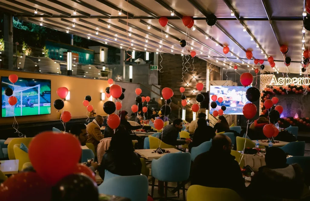
Certain colors stimulate hunger, while others reduce it. Warm tones such as red and orange are known to encourage appetite, making them popular in restaurants.
Creating Emotional Responses
Colors affect emotions: blue can calm, yellow can energize, and green often symbolizes freshness.
Reinforcing Brand Identity
The palette chosen reflects the restaurant’s personality, whether it is modern, traditional, casual, or luxurious.

Warm Colors and Their Impact
Red
Red is stimulating and can increase energy and excitement, often used in vibrant, fast-paced dining spaces.
Orange
Orange conveys warmth and friendliness, creating a social and comfortable atmosphere.
Yellow
Yellow inspires positivity and brightness, though it must be used carefully to avoid overwhelming guests.
Cool Colors and Their Role
Blue
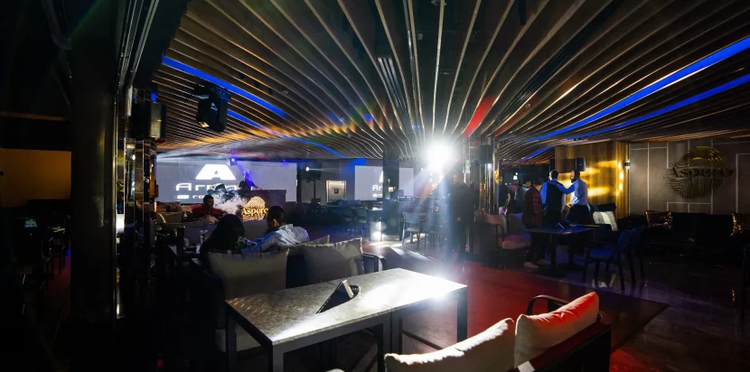
Blue is calming but not commonly used for food areas, as it may suppress appetite. However, it works well for creating serene, elegant environments.
Green
Green suggests freshness and health, making it ideal for venues focusing on organic or vegetarian menus.
Purple
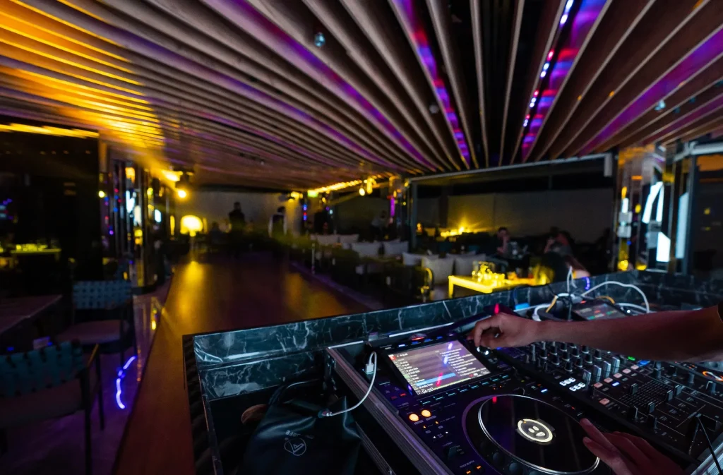
Purple conveys luxury and creativity, suitable for fine dining experiences with a unique flair.
Neutral Colors in Restaurants
Black
Black represents sophistication and elegance, often paired with metallic accents in luxury dining.
White
White conveys cleanliness and openness, providing a versatile backdrop for other colors.
Brown and Earth Tones
Natural colors create warmth and comfort, making spaces feel grounded and welcoming.
The Role of Lighting in Color Perception
Enhancing Color Effects
Lighting can make colors appear more vibrant or subdued, altering how guests perceive the space.
Matching Mood to Time of Day
Brighter lighting works for lunches, while dimmed tones complement evening dining.
Example of Aaspero
At Aaspero, lighting enhances carefully chosen colors, creating a balanced atmosphere for both daytime and evening dining.
Cultural Influences on Color Choices
Egyptian Traditions
Colors inspired by Egyptian art and heritage, such as gold, turquoise, and deep reds, reflect cultural richness.
Blending Modern and Local
Venues like Aaspero combine modern palettes with subtle Egyptian influences, appealing to both locals and international guests.
Seasonal Adaptations
Some restaurants adjust color accents to match seasonal menus or special occasions.
Designing with Purpose
Matching Cuisine and Concept
Mediterranean restaurants often use blues and whites, while steakhouses may favor darker, earthy tones.
Supporting Guest Flow
Colors can guide movement through the space, highlighting focal areas like bars or private dining rooms.
Enhancing Comfort
Balanced palettes reduce visual stress, making guests feel more relaxed and welcome.

Why Aaspero Excels in Color Design
Cohesive Branding
Aaspero selects colors that match its brand identity, ensuring consistency across interiors and menus.
Emotional Connection
The palette is designed to create comfort and luxury, encouraging guests to associate positive emotions with the restaurant.
Adaptive Spaces
From romantic evenings to business lunches, Aaspero uses colors that adapt to various moods and events.
Memorable Experiences
The thoughtful use of colors makes Aaspero stand out, ensuring guests remember not only the food but the entire setting.
Finally
The psychology of colors in restaurants is about more than style; it is about shaping appetite, emotions, and memories. Warm, cool, and neutral tones all play different roles in crafting the desired atmosphere. Venues like Aaspero show how a balanced and intentional approach to color can elevate dining into an immersive, branded experience. For restaurants in Egypt and beyond, understanding color psychology is essential for creating spaces that delight the senses and keep guests coming back.
 Phone: +010 50 855 838
  Email: restaurant@asperogroup.com


Comments are closed